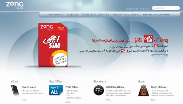
Zong has got new design and layout for its corporate website. Apparently, transition is in process – however most part of revamp is done.
New look gives professional feel that old design was lacking. Also elements are better arranged with top menu well in place. Enough space on home page is designated for featured offerings, for instance its AchiSim for now – we may see scrolling featured offerings in a day or two.
Zong has incorporated very intelligent, search button. It’s not intelligent only in terms of search results but its predictive nature will save you time of loading a new page.
Zong has added new features, including Media Center, CS Center, about us along with enhanced form of coverage map, career portal.
Rest you click on this link to see yourself – do share your experience and thoughts in comments, particularly about the color scheme.
No comments:
Post a Comment